Friday, 29 June 2012

Apothecary Art - Card number 3

Hi everyone, I don't want you to get bored with this stamp set and my posts so I won't keep repeating the same information. I'll just say that this card uses the same colours, designer papers and tools as the other cards I have already shared with you. Here's the third card:


This one uses the pleated satin ribbon in Blushing Bride and in this photo you can finally see I really did use Rich Razzleberry card:
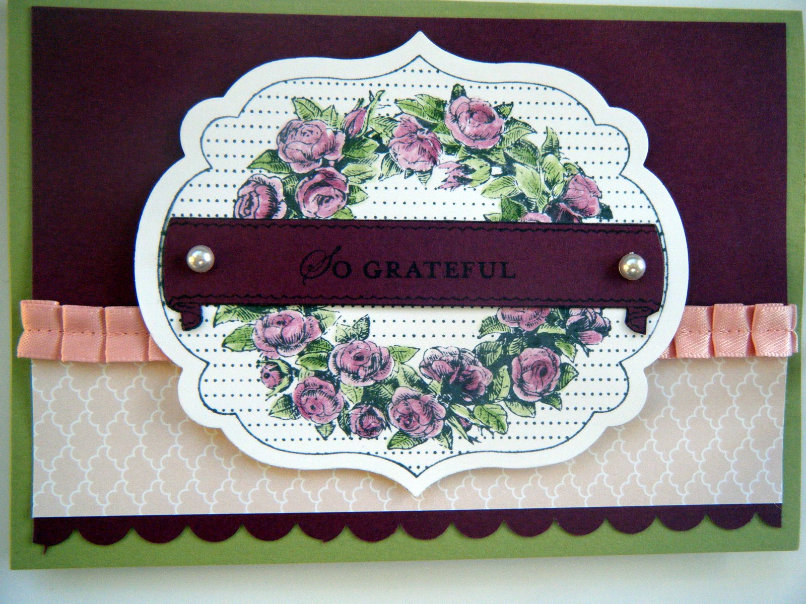

Here's a close up of some of the colouring. I used Rich Razzleberry and Pear Pizzazz inks with a blender pen:


Well, I've nearly shown you all the cards we made in card class. Check back soon for the last one soon. x

Wednesday, 27 June 2012

Apothecary Art in Pear Pizzazz

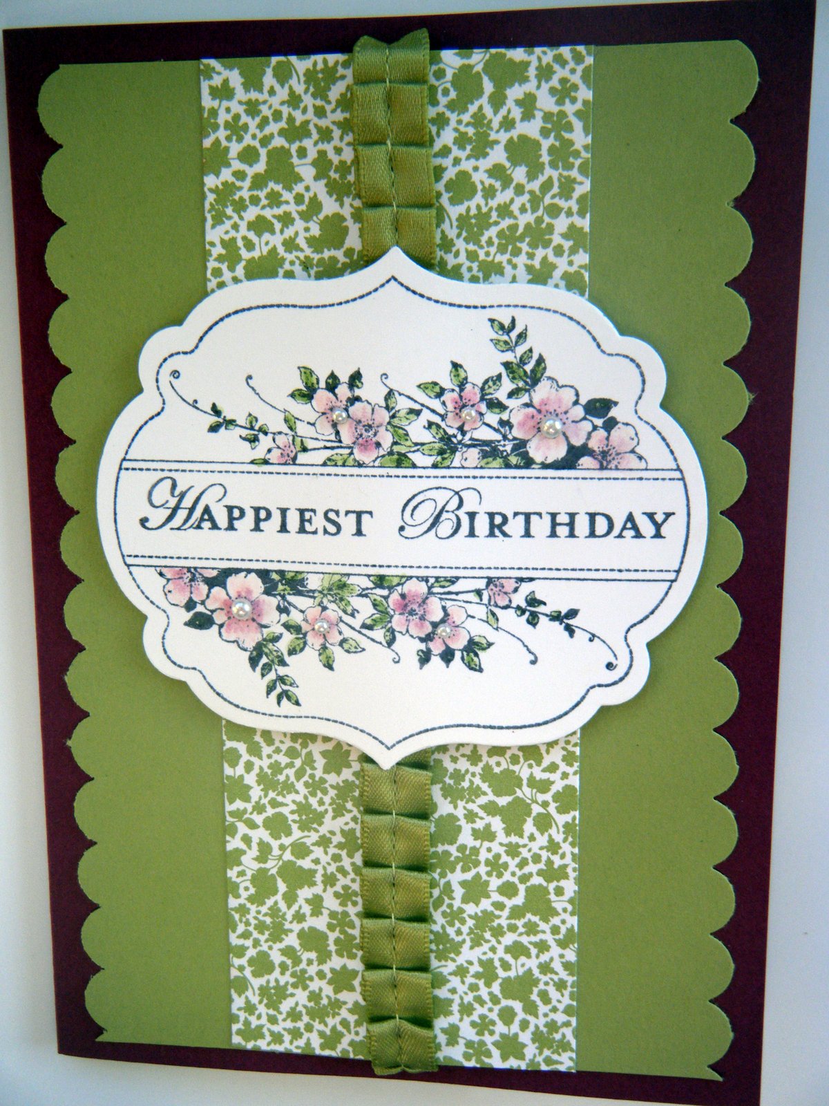
Morning everyone. This is another one of the cards we will be making today. This one is in Pear Pizzazz with a Rich Razzleberry base card (although it looks brown in these photos):


The paper is from the Twitterpated designer papers and the ribbon is the lovely pleated satin ribbon, in Pear Pizzaz. Here's a close up of the stamped Apothecary Art panel, die cut using the Framelits Label dies and coloured with ink pads and a blender pen:


The edge was created using the Scallop border punch and this photo shows how I added a few pearls to the centres of the flowers:


I'll show you another card in a few days time. Hope you like this stamp set as much as I do. Contact me if you want to buy any of the supplies. x

Monday, 25 June 2012

Apothecary Art 70th Birthday

Hi everyone, I thought I would share this 70th birthday card with you today. I made this for my mother-in-law's birthday a couple of weeks ago. This card happens to use the Apothecary Art set which we'll be using in class on Wednesday:


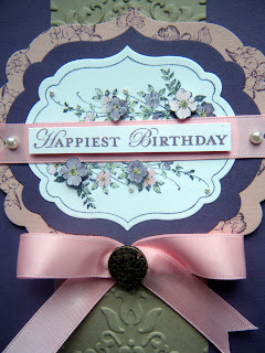
Photos never seem to do cards justice but this is an A5 card, using Perfect Plum for the base colour. The strip down the middle is Crumb Cake, embossed using the Vintage Wallpaper embossing folder aand the Big Shot. You can see the embossing in more detail in this photo as well as the '70' which was die cut using the Timeless Type Junior Alphabet, and decorated with pearls.


I used Pink Pirouette for my contrast colour and added a Pretty in Pink bow with one of the beautiful vintage brads in the centre:
I stamped the image from the Apothecary Art stamp set in grey ink and coloured it using ink pads and a blender pen:

I cut out some of the flowers to 3D them. Fidddly, but worth it I think:

As before the Framelits labels dies match the stamp shapes exactly. I hope you like this card, my mother-in-law did. I'll be showing you the other projects from card class over the next few posts. Check back soon. x 

Saturday, 23 June 2012

Apothecary Art card classes Wed 27th

Good evening everyone. I have been very remiss and not told you about the next card class. It's on Wednesday 27th June and we will be using the lovely Apothecary Art stamp set. Here's one of the cards we will be making:


I have used lots of lovely products on this card. Can you see how the new framelits dies match the stampset shape exactely? Stampin' Up! are doing this more often now and I'm sure there will be more matching products when the new catalogue comes out in October. Also, what about the sumptious pleated ribbon? Here's a close up: 


For this card I have used Pear Pizzazz as the base colour and Rich Razzleberry as the contrast. The ribbon is also in Pear Pizzazz. The papers are from the Twitterpated designer series papers (remember there's a special offer on the papers during June - buy three packs and get a fourth pack free). We will be doing some colouring in this class using the ink pads and blender pens. We don't often do any colouring so if you enjoy colouring your stamping, then this is the class for you:


If you would like to join us then please contact me on 07970 708348 or mapleleafstampin@yahoo.co.uk
The class is only £12 which includes everything you need to make the projects, except for adhesives. I hope you will decide to join us. Keep an eye on the blog as I'll be posting more of the projects soon. x

Thursday, 21 June 2012

Elegant Mixed Bunch

Hi everyone, this is the last card from the Mixed Bunch class and my favourite. The photo doesn't really do it justice but some of the close ups are better:


For this card we used some of the lovely Twitterpated designer papers to create a background layer. I embossed a piece of Whisper White using the Stripes embossing folder and the Big Shot. The Blossom punch was used to punch the flower shape and the layer was stuck onto the base card, using 3D pads. The colours we used are Blushing Bride and Cherry Cobbler.

Additional flower shapes were cut using the Blossom Party die and the Big Shot, the Boho Blossom punch and the Itty Bitty punches. Flower centres were stamped and added:


A strip of Pleated Satin ribbon in Blushing Bride was added. This ribbon is truly gorgeous and comes ready pleated - all you need to do is stick it on your projects. We'll be using more of it soon: 

There is plenty of room to add a greeting although I quite like it left with 'white' space. I'll be back soon with more projects. x

Tuesday, 19 June 2012

Mixed Bunch Butterflies

Good morning. Today's card from card class is a bit more intricate than the last one. In this one we have used the ornate flower from the Mixed Bunch stamp set to make butterflies:


To make the butterflies, I stamped the flower twice in Versamark ink onto Whisper White. I then heat embossed it with clear embossing powder. Using daubers and Calypso Coral and Daffodil Delight ink I covered the flower image. The bits that have been heat embossed will stay white and show through. The rest will have a lovely soft colour. Punch the flowers using the Blossom punch.

Cut 2 petals out of one of the flowers in a 'V' shape, making the buttefly shape. The 2 petals that you cut away can be attached underneath the butterfly to give it a 3D effect. Cut another 2 petals from your second flower to 3D the other wing. Here's a close up which hopefully explains it a lot better than I can:


I used Calypso Coral and Daffodil Delight for my base card with a layer of First Edition Speciality paper. Calypso Coral ruffled ribbon was glued across the card front and the greeting, from Petite Pairs, was punched using the large oval and layered onto one of the tags from the Sizzlets Lots of Tags set, cut using the Big Shot.

I hope all of this made sense. If you would like to try any of these techniques then why not book a party to take place at your own house where you can have a play with some of these products. x

Sunday, 17 June 2012

Simply Mixed Bunch


Good morning everyone. Today I'm sharing the first of the cards we made at card class this week. This card was quick and easy but very effective:


Once again, the colours are not showing up very well but this card was made using Concord Crush and Whisper White card stock, Concord Crush ink and the Mixed Bunch stamp set. The stamp set has a matching punch so there's no need to do any fiddly cutting out. The greeting has been stamped using the Curly Cute stamp set. The stamp set comes with several different centres which I used to create the background and the middle of the flower.

Here's a close up. I think the rest is fairly self explanatory:
 
If you'd like to buy this stampset and/or the punch, please contact me. I'll be posting another one of the cards made with the same stamp set soon. x